F5 Analytics and Visibility Solutions > Class 5 - F5 Insight for ADSP (AppWorld 2026 | 2 Hours) Source | Edit on
Ticket 04 – Review Connection Count Deviation (VS)
Title: “Why are some virtual servers showing connection count deviations?”
Ticket Description
The operations team has noticed fluctuations in connection counts across several virtual servers.
An alert has been triggered under Anomaly Detection for Connection Count Deviation.
Before taking any action, the team wants to review the deviation data and understand which Virtual Servers are outside of expected thresholds.
Your task is to review the deviation dashboard and identify the most impacted Virtual Servers.
Context
Location: Home Dashboard
Section: System Report Cards
Category: Anomaly Detection
Metric: Connection Count – Standard Deviation Change (VS)
Virtual Server CentralRegion-bigip-01/Common/backup-app
Tasks
Navigate to: Home >> System Report Cards
Locate the card: Anomaly Detection and click on: Anomaly Detection
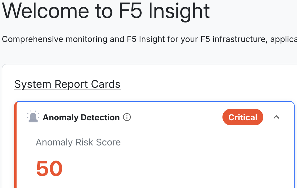
Within the expanded panel, locate: Connection Count Deviation Analysis and click on: View Details
Scroll down to the Virtual Servers table.
Review each Virtual Server and identify:
- Status (Critical, Warning, Good)
- Expected Connections
- Current Connections
- Deviation value and percentage
Pay attention to severity coloring:
- Red indicates Critical deviation
- Yellow indicates Warning
- Green indicates Normal/Good
Select the Virtual Server CentralRegion-bigip-01/backup-app (It may have the status of Needs Attention or Critical).
The graph above will update based on your selection.
Review the Connection Count Deviation Analysis graph on top.
Observe:
- Actual connection count
- Expected connection count
- Upper threshold
- Lower threshold
Use the time range selector (1h, 6h, 1d, 1w) in the upper-right corner of the dashboard to review different time windows.
- Last 1 hour (focus on this)
Deliverables
Briefly answer the following:
- Reviewing the graph, provide the expected connection count for the VS specified above.
Review the following for additional information and trends:
- The total number of Virtual Servers listed
- How many are Critical
- How many are Warning
- How many are Good
- The Virtual Server with the largest deviation percentage
- Any patterns you observe in the deviation data
Hints
- Hover over the red expected line in graph to view associated data
- Hover over points in the graph to see exact values.
- View the table data
- Try changing the time range to see if deviations are persistent.
- Sort the Virtual Server table by deviation percentage.
- Focus first on Critical (red) entries, then Warning (yellow).
This concludes Ticket 4.
Go to Ticket 05 - Review Pool Availability Ratio Deviation
Go to Overview